

Anta
Anta, on the surface of the font, is a square character with four sides, horizontal, vertical and stable, which implies Anta‘s spirit of starting a business and being a man, fully embodies Anta‘s business philosophy; from the perspective of brand interpretation, it is more reflected in Anta‘s thick accumulation, thin hair, and steady pace to open up domestic and foreign markets; from the perspective of brand logo combination Look, it‘s refreshing and energetic again.
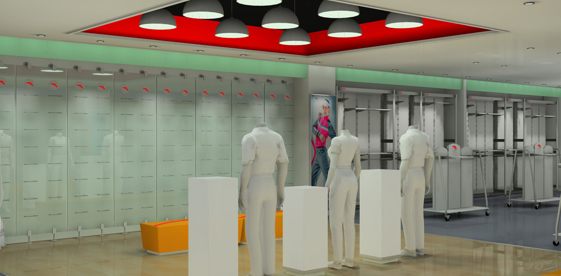
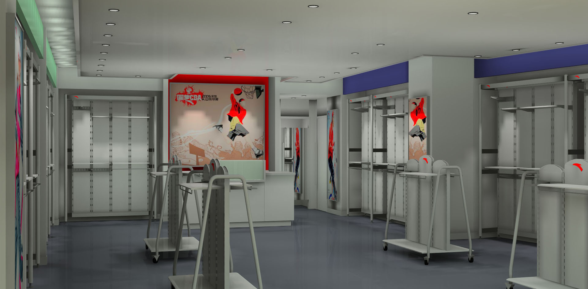
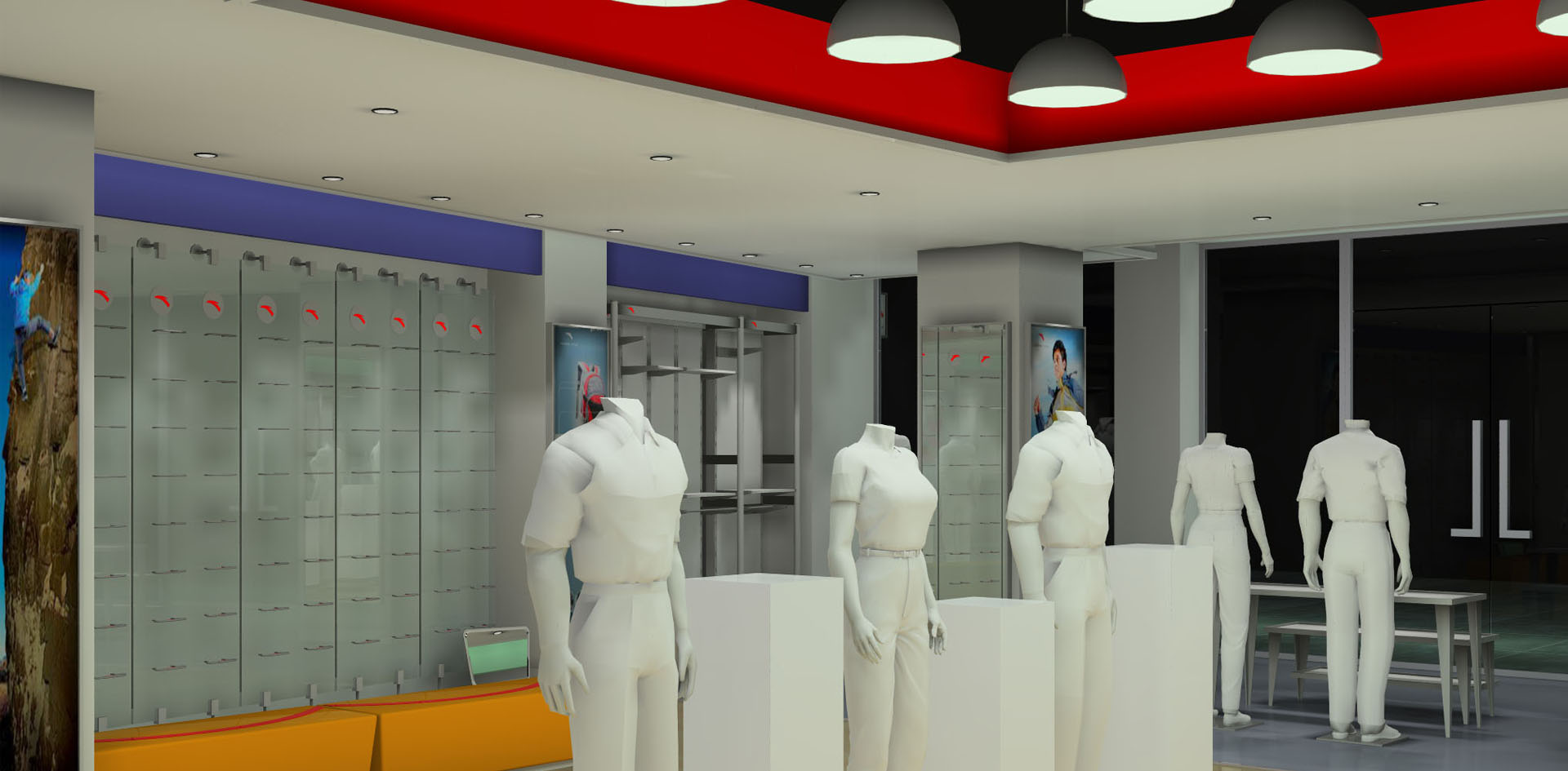
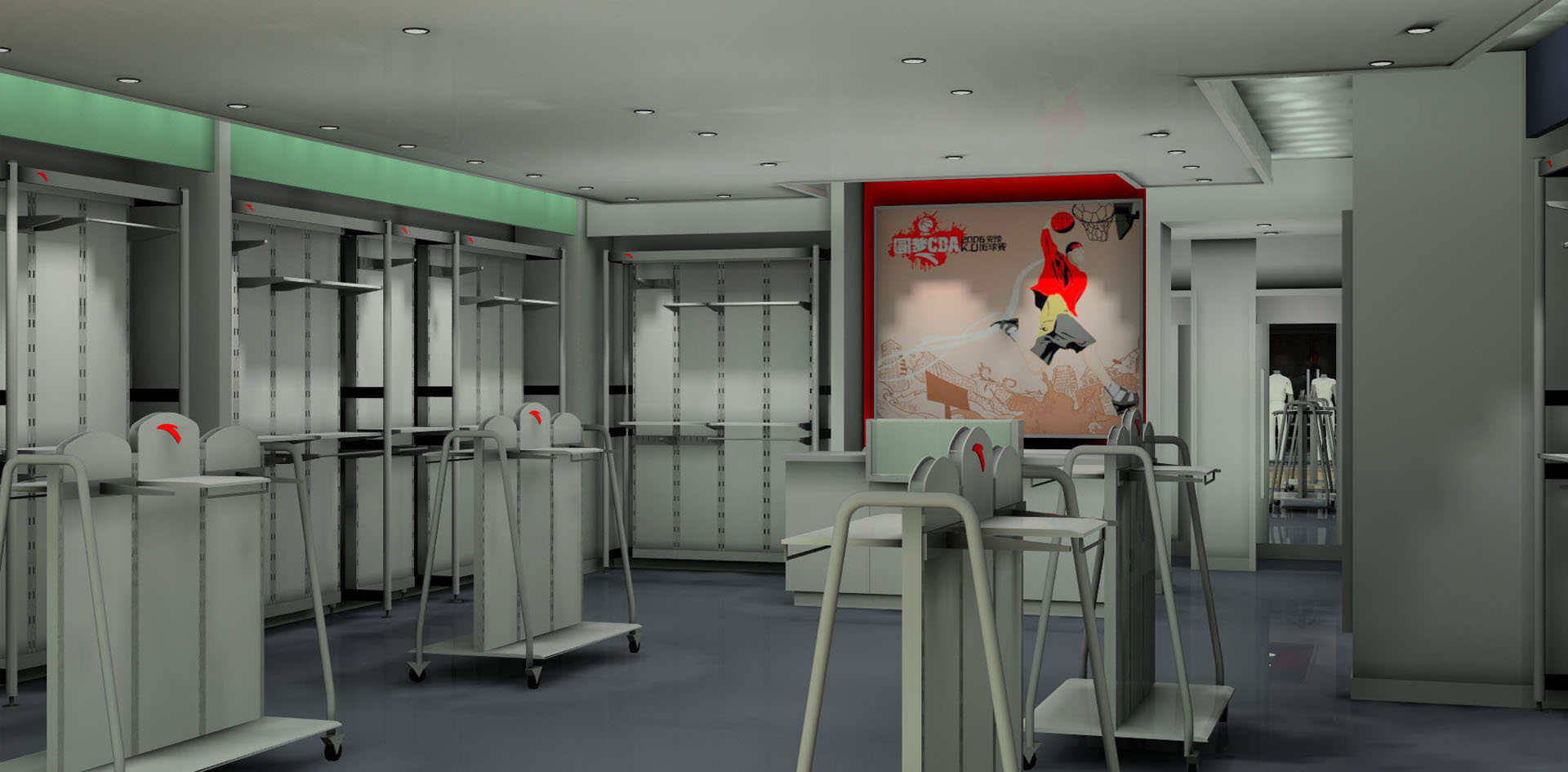
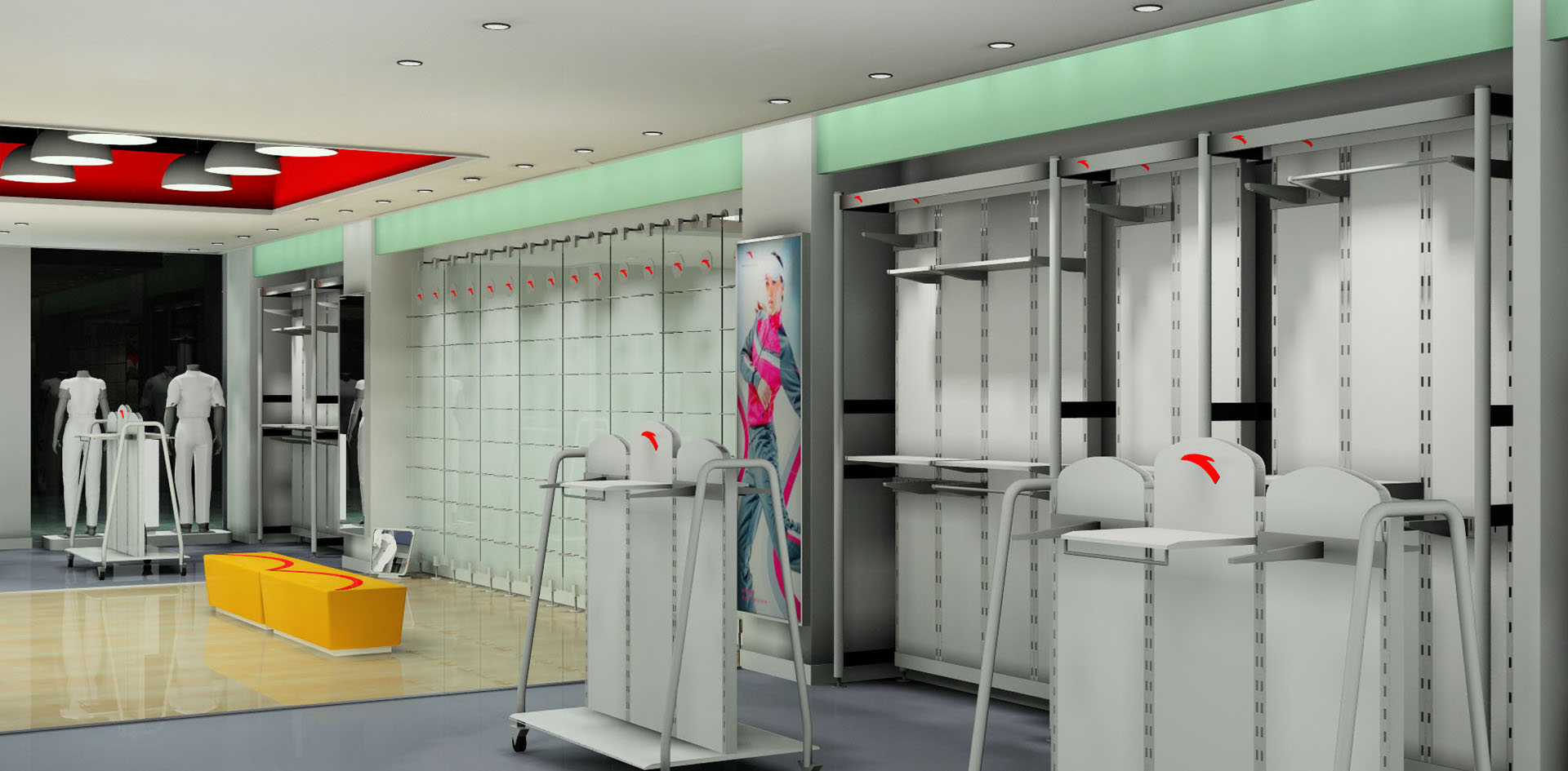
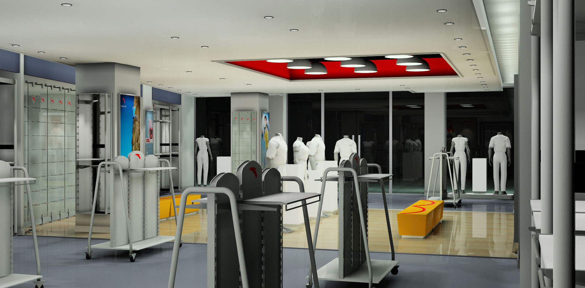
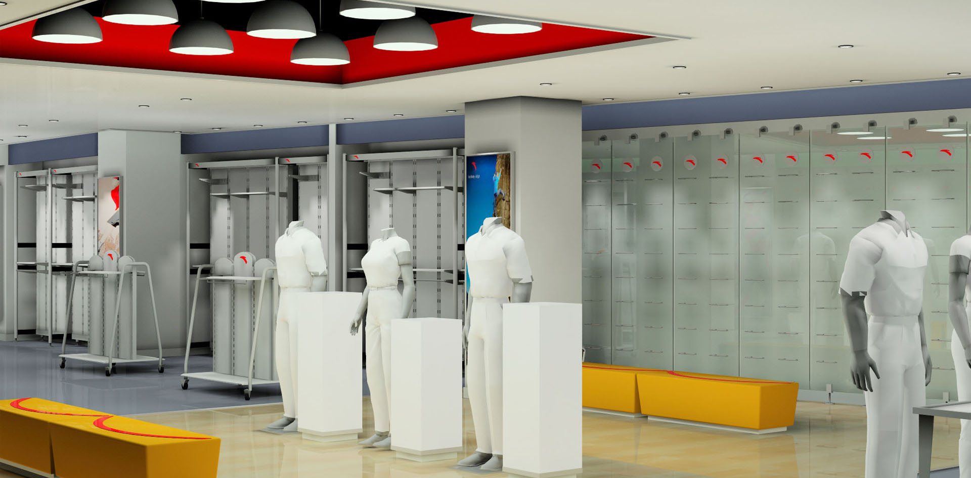
In this era of rapid development, people‘s physique gradually can‘t keep up with the rhythm. The main group is young men and women. Fully considering people‘s needs, Anta‘s leisure series meet the aesthetic needs of young people. A large number of leisure clothes are decorated. Leisure clothes are not only beautiful, but also very comfortable to wear. Shoes are also simple and easy to mix and match. They are prepared for fast-paced people to relax and add an ordinary happiness to busy people. Secondly, another major feature of this case is that it grasps the design of the window very well, displays the products, brands and images of the company powerfully, combines the powerful marketing mode with the store management, and also explains the concept that a good design is to serve the product sales.
2020|03